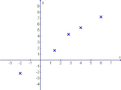
The data given are mostly random values that may not be lying on a straight line.
Therefore the technique of drawing this straight line on the graph becomes a crucial skill as it may results in producing inaccurate answers or outcomes.
An example is presented here for discussion.

Diagram 1: Various random co-ordinates scattered over the sheet
How do we plot a suitable straight line from these few scattered co-ordinates?
Many "funny" ways exist that reflects poor understanding of the purpose for straight line plotting.
Way one:
Connecting up the points in sequence ==> Results in non-straight line end-to-end.
Way two:
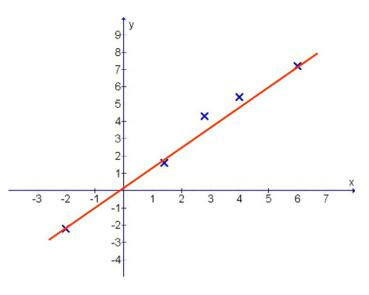
Connecting the extreme two co-ordinates ==> Results in unbalanced straight line (diagram 2)

Diagram 2: Uneven gaps between points and line drawn
Here you can clearly see that there are 2 points that are above the straight line by a certain gap. The spread of the random points are not evenly balanced about the straight line drawn.
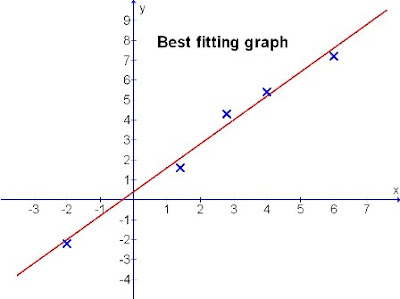
Let's see a better way to fit the line to these randomly scattered points. (Diagram 3)

Diagram 3
In diagram 3, you can see that the scattered points are evenly balanced across the length of the straight line drawn. The gaps of the crosses are almost the same through.
This is termed the "Best fitting straight line".
Therefore in plotting a straight line, it is the evenness that counts. The spread of the points has to be balanced so that the individual errors of the given data to the line can be minimised. The line drawn is then one that will produce a more accurate results.
Never imagine that so much thoughts are needed just to plot a straight line graph, right?
:-)
No comments:
Post a Comment