Showing posts with label graph. Show all posts

Saturday, 24 April 2010

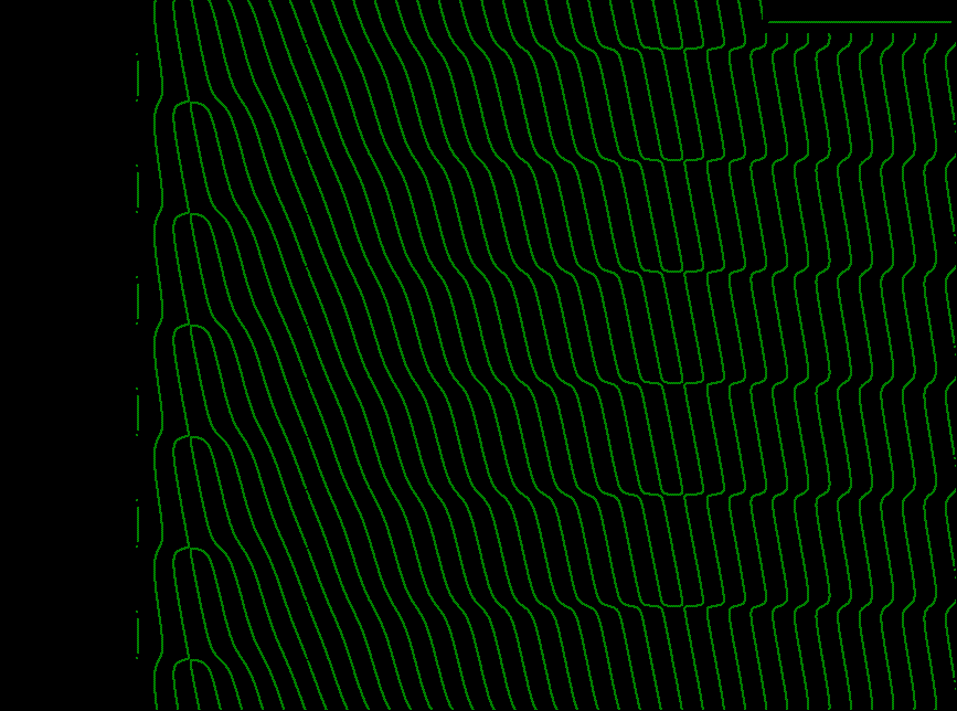
A Mathematical Waterfall

'
Mathematics equation can be fun.
It is not only used as a problem-solving tool, it can be used to create visual image simulating scene.

By trying a few equations, anyone with patience and basic maths knowledge can do it.
Simply create an expression or equation in a graph and tweet it to form any image.

Here you will see an image formed up to look like a waterfall.

Enjoy yourself.


This was done with both logarithm and trigonometry functions.

:-)

Tuesday, 30 March 2010

Using Equation To Create A Square Graphically

'
While studying maths, I have been exposed to equation that forms a circle.

We know that x^2 + y^2 = 1 creates a circle.

But I have been wondering what is an equation to form a square.

I had tried a few mathematical expressions till today.

And finally I found the interesting and mysteries equation. 
It utilises the same concept as the circle except that hyperbolic trigonometry is applied.

Below is a graph plotted with that equation.


The corners are rounded though. Any one has any try with a more sharper corner?

Graph is a wonderful tool as it can present results visually with one view.
Appreciating maths and using it appropriately can reduce many complex problems.

Maths is interesting.

.

Wednesday, 16 September 2009

Purpose of Graph

.
What is the purpose of graph?
This may be the question every learners first ask when they were exposed to this maths topic.

When do we use graph as opposed to using, for example, Argand diagram or vectors sketch?

Graph by nature is a graphical presentation of data that collectively form into information that reflects the trend of some parameters.

It shows the past, current and possibly the future (prediction).

Graph is a relative as well as an absolute maths tool for people using it.

An example of graph application is that in stock market data prediction.
Using past records, people tends to forecast the future through looking at the graph.

Another example is in engineering work.
Collecting data of a certain electrical system behaviour, engineers can predict the failure or potential life of its operation.

A simple graph is plotted with normally 2 parameters.
But this is not always true.
Graph may come in 3 dimensional. The x, y and z direction.

Knowing graph is an alternative problem solving skill or prediction skill.
It allows users to see an overview of the relation between specific targets.

Graph is wonderful if you let it be.
Enjoy it.

:D

Sunday, 13 September 2009

Graph | Length of line

'
In graph plotting, something we need to know the length of a segment of the line plotted.

This may be for the distance to be travelled (like in a field trip).
Or it may be for checking the material to be used in building a slanted pole / support.

Let's take an example to illustrate.


From the plot, if we are to calculate the length of the line between the two red crosses, we can use the well-known Pythagoras' Theorem.

However, we need to know the co0ordinates for the crosses or markres first, to check their positions.
For the lower cross, we will have x1 = 2, and y1 = 3.
For the upper cross, x2 = 6 and y2 = 5.

This allows us to determine that the length in the x-axis direction is 6 - 2 = 4 units.

The length in the y-axis direction will be 5 - 3 = 2 units up.

Using then Pythagoras' Theorem, lenght of targetted line segment will be given as sqrt(42 + 22) = 4.472 units.

From graph and its application with other maths theorem, you can find answers easily.
It is the choosing of the appropriate maths tools that is is key to having a solution in a proper way.

Many a times, you may find answers or solutions through different techniques and methods. But the number of steps are more. But it is still correct.

It is through practice and gaining experience in maths problem-solving that helps you reach a level that let you handle maths with mental ease and confidence.

Everyone can achieve that. It is the attitude. Do not fear maths. It is just a tools to solve problems.

Maths is interesting! Love maths !

Cheers!   :D

Friday, 10 July 2009

Amazing Trigonometric Art

'
Maths does wonders when presented in graphical form.

This is provided the mathematical equation makes it so.

Using the trigonometric relation, x sin x = y cos y, the artistic effect of this equation is shown below.


You can now see that, though maths can be boring at times, it can reflect its beauty through other means.

Don't you agree?

Maths is Interesting! Watch out for it!

.. :D

Friday, 10 April 2009

Constants and Variables

In maths, you will encounter many "letters". This "letters" are the symbols used to form equations and mathematical expressions.

("letters" here may mean symbols like the theta, beta, etc)

Some of these symbols are constants and some represent variables.

Knowing what are constants and variables is crucial for mastery of maths learning.

What are constants?
Constants, as the word literally means, are items that have number that never change.

What are variables?
Variables are symbols that changes in value.

Example A:
y = 3 x + 2

y and x are variables, and 3 and 2 are obviously constants.


Example B:
log x = 5y

x and y are variables , and 5 is constant.

Example C:
y = mx + c ( for straight line equation)

y and x are variables, and m and c are constants.

This may be confusing to some maths students when they start plotting graphs.
Here, the straight line is continuously moving with the value of x and y.

So why is the "m" identified as constant?

You need to know that "m" represents the "GRADIENT" of the line.
The line has the same slope at any value of x and y.
Thus "m" is a constant.
This is a typical concept that commonly goes wrong.

Therefore when you really understand what changes are considered "variables" and those that remain stable are known as "constants", you are in line for good maths study!

.

Sunday, 15 February 2009

Mathematics Letter S

Using graph and equation, you can create wonders.

Graph does not only mean lines and curves. It can be "letter" too, as seen below.


With creativity and a bit of trying, you can have surprising images formed through graphs.

With mathematics, you are not limited to equation and solving problem. You can have fun and that makes mathematics interesting.

:-)

Sunday, 5 October 2008

Creating A Maths Picture

Maths can be used in many ways.

It is normally used to solve daily calculations related to work, life, etc.
It can be used to model a system to understand its performance and behaviour.

However, on the fun side, it can be used to create a picture using graph as a means.

Here in this post, a picture formed through merging trigonometry with modulation technique is shown.


What do you think this picture is about?

While creating this maths picture, a kid so happened to have a glimpse of it, and commented that it looked like the front view of an aeroplane.

For me, it seems to be the captured voice of Optimus Prime, the Transformer Autobot leader.

With maths, if you understand the underlying principles of various elementary topics, you can freely come up with any mathematical figures that you wish.

Here, I have simply used the special sinc function modulated (multiplied) by a high frequency trigonometric sine function to get this mixed result.

Using graph is one way to form picture, like the one created here.
It is fun seeing your imagination materialise through using maths and graphs as the tools.

Try it for yourself. You will enjoy maths and its fun picture creation.

:D

Tuesday, 19 August 2008

How To Draw Best Fitting Straight Line

In graph analysis, we are normally given a set of co-ordinates to plot and extract the important parameters from the straight line drawn.

The data given are mostly random values that may not be lying on a straight line.

Therefore the technique of drawing this straight line on the graph becomes a crucial skill as it may results in producing inaccurate answers or outcomes.

An example is presented here for discussion.


Diagram 1: Various random co-ordinates scattered over the sheet

How do we plot a suitable straight line from these few scattered co-ordinates?

Many "funny" ways exist that reflects poor understanding of the purpose for straight line plotting.

Way one:
Connecting up the points in sequence ==> Results in non-straight line end-to-end.

Way two:
Connecting the extreme two co-ordinates ==> Results in unbalanced straight line (diagram 2)


Diagram 2: Uneven gaps between points and line drawn

Here you can clearly see that there are 2 points that are above the straight line by a certain gap. The spread of the random points are not evenly balanced about the straight line drawn.

Let's see a better way to fit the line to these randomly scattered points. (Diagram 3)


Diagram 3

In diagram 3, you can see that the scattered points are evenly balanced across the length of the straight line drawn. The gaps of the crosses are almost the same through.

This is termed the "Best fitting straight line".

Therefore in plotting a straight line, it is the evenness that counts. The spread of the points has to be balanced so that the individual errors of the given data to the line can be minimised. The line drawn is then one that will produce a more accurate results.

Never imagine that so much thoughts are needed just to plot a straight line graph, right?

:-)

How To Get Gradient and Intercept from Two Points

Gradient and intercept are two key items to a straight line expression.

In maths, to obtain the equation of a line from two given co-ordinates, we inevitably think of graph plotting. This is one good way to obtain the answer by finding the gradient and intercept.

Let's take an example.

2 points: (1, 5) and (3, 11) are given. What is the straight line expression?

By plotting these two points on a graph, we can easily determine the gradient and intercept, and then the mathematical expression for the equation.


Diag: Graph with 2 points.

From the graph, to determine the gradient, we can check:

  • increase of the vertical unit with reference from the 2 points as 11 - 5 = 6 units, and

  • increase of the horizontal unit from the 2 points as 3 - 1 = 2 units,


Gradient = change in vertical / change in horizontal = 6 / 2 = 3

The next item is the intercept, and directly from the graph, it showed the value to be 2.

Therefore, the straight line expression comes to y = 3 x + 2.

This graphical method is OK, simple and easy to do.

But is this the only way to get the straight line expression from 2 points given?

No, there is at least one other method. Don't forget maths is exciting and amazing, if one wishes it to be.

What is the other way? The answer is the use of simultaneous equations!

How so?

Note, given 2 co-ordinates and having to find 2 unknowns satisfies the basic requirement to set up 2 equations for simultaneous solving.

We know the general straight line equation to be y = mx + c.

Therefore with the known co-ordinates,

11 = m(3) + c -----(A)

5 = m(1) + c -----(B)

By elimination method, (A) - (B), gives,

6 = m(2) ===> this gives m = 6 / 2 = 3 (The gradient!)

With m = 3 found, let's put back into equation (B),

5 = (3)(1) + c ===> c = 5 - 3 = 2 (The intercept!)

Thus, the straight line equation is y = 3 x + 2. This is the same as the one obtained with graphical method.

Therefore, from the simultaneous way, we can still obtain the expression from the 2 given co-ordinates, without plotting the graph.

Either which way is fine.

What is interesting is that once you master the principles of maths, you can be flexible to choose the method that you like and still arrive at an appropriate answer.

Enjoy maths! :)

.

Saturday, 16 August 2008

Leading and Lagging Sine wave

In maths, if we practice well with understanding, we will surge forward in our learning, leading the others and gaining valuable knowledge.

However, if we take it easy, trying to buy time and not learning seriously, our maths learning will lag behind others.

In trigonometry, sine waves do perform the same.

If an energetic, excited sinewave is around, it will always lead the pack, staying ahead of the rest.

A lazy sinewave, on the other hand, will struggle to follow, always lagging behind the group.


Diagram 1 A race of sinewaves

From diagram 1, we can see that the winner is obviously the green one.

Assuming the finishing line is the y-axis (vertical line), we can see that the green-coloured sinewave leading the others, followed by the blue sinewave, and the lazy pinkish sinewave lagging at the back.

Another way to view this is to set the blue sinewave as reference (x = 0 second).
The green sinewave has crossed the line (y-axis) 1 second before. ==> Lead
The pink sinewave has yet to reach the y-axis having 1 more second ==> Lag

So do you want to be the enthusiastic green sine wave or the lazy pink sine wave in your maths education?
.

Argand Diagram - Complex Number In Graphical Form

Complex numbers, which are imaginary roots to equation, can be represented in a special graph called the Argand diagram.

An example of complex number 4 + i3 is illustrated graphically below in Diagram 1.


This Argand Diagram represents both the Real number (horizontal axis) and Imaginary number (vertical axis) in a complex number expression.

In this diagram, the polar (angle) information of the complex number can be extracted. The modulus or amplitude can also be obtained from this Argand diagram.

This special graph is therefore another useful mathematical tool used to compute or present complex numbers.

.

How To Identify Type Of Roots In Quadratic Equation

If we are asked to solve mathematical equations that equal to zero, the objective is to find their roots.

Roots are those numerial answers to the variable in the math equations.

Example:
Solve x2+2x+1 = 0.

Solution:
x2+2x+1 = (x - 1)2 = 0
This gives us x = 1 as the answer.
This x = 1 is the ROOT to the equation.

However, we need to know there are 3 types of roots to a equation.

They are:

  1. Real and different

  2. Real and equal

  3. Imaginary


How do we know or identify the roots given an equation?

One way to identify is through graph sketching and identifying the type of roots through the interception of the curve with the y=0 line (or x-axis).

Example A:
From the graph plotted (diagram 1), what is the type of root?

Diagram 1

From diagram 1, through observing the graph, we noticed the 2 red "x" markings that the curve makes with the y= 0 line (or the horizontal x-axis). These are the 2 roots of the equation (not known here) used to plot the graph.

The 2 roots in diagram 1, can be said to be Real and also Different, since they made true numerical values that can be readable by anyone understanding graph.

Example B:
What is the type of roots in diagram 2?

Diagram 2

In diagram 2, we see that the curve made only 1 point of contact with the x-axis or y = o line. Therefore, there is only one Real root for this equation used to plot the graph.

Example C:
How about the type of roots for this graph (diagram 3)?


Diagram 3

Diagram 3 is a bit special in the sense that we cannot see any root cutting the x-axis.

This, therefore, calls for imagination !

To solve equation that produce this type of "floating" curve, special roots called Imaginary roots are conceptualised. They do not exist and are thus un-real.

In short, when we see graph having no x-axis crossing by the curve, the roots are of type Imaginary .

The above is using graphical method to identify types of root in an equation.

Another method is through the famous "Quadratic Formula".

However, we do not require the full formula to identify the root type.

What we need is just the "(b2-4ac)" portion of the formula. This is sufficient to extract information to pinpoint the type of roots in any given math quadratic equation.

Note: The general quadratic equation is ax2 + bx + c2.

The demerit of this "Quadratic Formula" approach to identify types of root is limited to Quadratic equation. Equation in the order of 3 and above CANNOT use this approach and graphical method stand an advantage in this case.

How to use this Quadratic Formula approach to identify the root type?

If the numerical value of the "(b2-4ac)" is :

  • > 0 ==> The roots are Real and Different type

  • = 0 ==> The root is Real and Equal type

  • < 0 ="="> The roots are Imaginary type.


The type is logically derived as a result of square-rooting the "(b2-4ac)" .

The principle of graph reading and interpreting its data yields many useful information and applications. Graph can, therefore, complement other method of mathematical analysis to solve problems, and can at times be even simpler.

:)
How Can Graph Be Used As An Analytical Tool

Graph can be used in many ways. It can be used to show the trend of an event, it can solve unknowns as in simultaneous equations, it can identify the value of minimum or maximum points, and many more usages.

One important purpose of graph, however, is its ability to reflect the constraints of an equation or function. This function can come from a system under the Math Model.

Here, graph can analyse the weakness or strength of the system, or locate the value of a certain parameter that endangers its operation.

Let's show an example of the usefulness of Graph as an analytical tool.

Take the negative feedback amplifier as case-study.

The function or mathematical modelling expression of this amplifier is A / (1 + XA),
where the A is the amplification factor (or gain) of the amplifier and X is the feedback factor.

Let us plot the math equation and see the feature of this amplifier from the graph plotted.


In diagram 1, the math model equation is plotted with A = 1.

From this graph, let us analyse the features it exposes.

  1. When the feedback factor (X) increases, the overall gain (y) decreases. This is so since more output signal is feedback resulting in reduction of actual input.

  2. At the point when X = -1, the gain (y) becomes infinite! This is a dangerous value in that the amplifier will not operate as normal.


The 2 key features of the amplifier can therefore be revealed through proper analysis of the graph plotted using its model equation. The weakness of the system (amplifier) can then be exposed for caution and care in designing and usage.

.

How To Find Minimum Point In An Equation

Given a mathematics equation, sometimes we need to know the minimum point or values of its lowest co-ordinates. There are 2 methods to locate this lowest point in the equation.

The 2 methods are:

  1. graphical

  2. mathematical re-expression of equation


I shall deal with both methods here.

Example: y = x2 - 2x + 3 (a quadratic equation)

1) Graphical method

By plotting the curve generated by the equation, we are able to visually identify the lowest point and get the co-ordinates directly.

The demerit of this method is having to plot the graph out and the co-ordinate values are as accurate as plotting accuracy.

The graph is drawn as shown in diagram 1.


Diagram 1 Equation plotted to identify the lowest point on the curve

From diagram 1, you are able to see that the lowest point is at x = 1 and y = 2. (The point marked with the red cross). This graphical method is straight forward but needs effort in sketching the curve accurately.

2) Mathematical re-expression method

This method involves more manipulation of the equation rather than sketching graph.

It makes use of the "Completing the Square" method in factorisation to extract out the lowest point. For a review of the "Completing the Square" method, please refer to this link.

y = x2 - 2x + 3 can be re-written as

y = (x2 - 2x + c2) -c2 + 3

Note: The "-c2" term outside the closing bracket is to retain the originality of the equation.
The purpose is to form a y expression with an order of 2 or (x -c)2 for reason which will be clear later.

What is this "c" to be ?

By following the principle of the "Completing the Square" technique, "c" can be seen to be (2/2).

Therefore the new equation becomes
y = [x2 - 2x + (2/2)2] - (2/2)2 + 3

Now, here comes the important concept of this method to locate the lowest point.

From the new y expression, you see that to make the y value the lowest possible, the only thing you can do is to make the x value equal to the "c" value or the (2/2) value.
That is, [x - (2/2)] = 0 ==> x = (2/2) for lowest value of y.

When x = (2/2) = 1, y must then be -(2/2) + 3 = +2.

Therefore, the answer to the lowest co-ordinates is x = 1 and y = 2.

This is the same as for the graphical method. However, it does not involve tedious plotting, beside more accurate numerical values is ensured.

.

Line Of Symmetry

In graph plotting, there is a property whereby the graph has symmetrical reflection over a special line. This is the "Line of Symmetry".

What I meant is explained below.

We will take an example to illustrate this special line.

Example: y = x2 + 2

This is a quadratic equation that can be easily plotted.
However, there is another "sister" equivalent to this equation.

Make x the target (instead of the function y)!

y = f (x) = x2 + 2 ==> x = f(y) = sqrt ( y - 2) using basic algebra to do it.

Let us now sketch the 2 graphs f(x) and f(y), and observe their features.


From the diagram above, you can see two graphs. One is the original y function or f(x), indicated as black line. The sister equation of f(x) is the f(y), indicated by the red line. They have the same shape except for the orientation!

They are reflections of each other. But the line of reflection is the diagonal blue dashed line in between them. The equation for this blue line is the basic y = x.

This blue line is termed the "Line of Symmetry".

This y = x line does not only apply to this example. It applies to any equation.

:)

How To Draw A Straight Line Graph

Straight line graph is the most basic graph any math student must learn how to draw.

The general equation for a straight line is given by y = mx + c.

"m" is the gradient and
"c" is the value of the intercept the line makes with the vertical axis.

Let's start with an example y = (5/4) x + 2 .

The intercept that the straight line will make with the vertical axis is "+2" indicated by the red dot in Diagram 1.


Diagram 1

Next, we noticed that the gradient is m = (5/4). This meant that the vertical change is 5 units upwards (positive number) for a horizontal change of 4 units in the positive (right-going) direction. Let's find the other spot on the straight line. (Diagram 2)


Diagram 2

The other spot is identified after moving from the first red dot 5 units up and 4 units right. The unit movement is based on the gradient (m = 5/4) set in the equation.

Note: To draw a straight line graph, we only need 2 points.

With the 2 points identified, we are now ready to draw the line connecting the 2 red points.


Diagram 3

To summarise, we just need to follow 3 steps:

  1. Identify the intercept (c) from the equation and indicate it on the vertical axis

  2. Find the other point using the gradient (m) as a guide with the point in step 1 as start reference

  3. Connect the 2 points identified to obtain the straight line graph


This is as simple as A B C !

Another example: y = -2 x + 7.

The y-intercept is "+7" and the gradient is "-2", meaning, a drop of 2 units for 1 unit movement to the right. The graph is shown below (Diagram 4).


Diagram 4

Let's celebrate!

:)

What is Gradient of a Curve?

In line or curve plotting of a graph, we normally come across the term "Gradient". This is an important parameter that governs the profile of the plotted line or curve.

What is this "gradient"?

Gradient is defined as the ratio of the change in the vertical unit to the change in the horizontal unit (at a certain point on the curve).

From the definition, it implies that the larger the numerical value of the gradient, the steeper is the curve or line plotted.

There are two types of gradient:


  1. Positive gradient

  2. Negative gradient


The diagrams below illustrate the meaning.


Diag 1

Positive gradient (Diag 1) exhibits vertically upward increment for increase in horizontal direction towards positive "x" value.

How about Negative Gradient?


Diag 2

Negative gradient (Diag 2)
shows a downward tendency when moving towards the positive "x" direction.

For straight line equation of y = mx + c , "m" represents the gradient.

Example 1: y = 3 x + c means a positive gradient with upward-going line.

Example 2: y = -4 x + c means a negative gradient with downward-going line.

NOTE:
A) m (gradient) = 3 means a vertical upward change of 3 units for each horizontal unit of positive (right-going) change.

B) m = -4 means a vertical drop of 4 units for each unit of horizontal positive change.

C) m = 1/3 means an increase of 1 unit upwards for 3 units of horizontal positive change.

However, do note also that for straight line, the gradient is constant as the gradient does not change along the line.

For curve, the gradient is changing as we move along the profile of the curve. Its gradient is therefore not constant, and may vary from negative to positive in numerical value (or vice versa). Diagram 3 below illustrates the point.


Diagram 3: Varying gradient for curve (quadratic function)

In diagram 3, we can see that as we slide along the curve from left to right, the gradient (as shown by the red straight line) changes in its slanting direction. The line on the left is of negative gradient whereas the one on the right is positive in gradient.

The importance of understanding gradient lies in predicting future happening from the trend the curve is moving. An example in real-life engineering application is the termination of the charging process of battery through monitoring the charging profile and its gradient value.

Easy to understand? I hope with the introduction of cartoons in this post, maths is made interesting.

:-)

Graph In Logarithmic Scale

In graph plotting, we can have a choice to plot the raw data (from the math equation) directly using the conventional y- axis (vertical line) and x -axis (horizontal line) , or modifying the horizontal axis parameter to match the given math expression.

Which technique to use depends on our purpose.

If the objective is to present the data as it is, and revealing the trend the raw data ( y and x) gives regardless of its plotted profile, then the conventional y-axis and x-axis method suffices.

If the objective is to obtain a straight line graph from the non-linear (assumingly) math equation for analysis purpose, then the need to modify the horizontal axis parameter before plotting is required. Refer to this link for details on straight line conversion for non-linear math equations.

Example: y = log x

In direct plotting of the above expression, we will get a non-linear presentation as shown in Diagram 1 below. (The horizontal parameter is directly the "x" data.)


Diagram 1: Non-linear presentation of the y = log x (Horizontal axis: x)

When we desire to have a straight line graph, we can plot the horizontal axis with the modified data of "log x" to match the generic straight line equation of y = mx + c.

The below graph is plotted in Diagram 2 with the horizontal data as "log x". Here we should expect a straight line graph to appear.


Diagram 2: A straight line graph with modified horizontal axis of "log x" data.

** But note that this post will explain another method to achieve a straight line plot when the math equation involves the logarithmic operation. **

The disadvantage of the second method presented above involved the modification of the horizontal parameter which may results in confusion to the raw "x" data.

What this new plotting option involves is not the modification of the horizontal parameter but the re-adjustment of the division between the scales of the horizontal axis.

This re-adjustment of the horizontal scale results in the "Logarithmic Scale". This scale is a special scale that increases logarithmically while keeping the parameter as the raw "x" data in the math equation. The merit is the outcome is the desired straight line graph.

Let's see the y = log x expression plotted in the Logarithmic scale. (Diagram 3).


Diagram 3:
The straight line plot with Logarithmic scaling while keeping the raw "x" parameter.

Therefore, the math expression can be plotted using 2 techniques to achieve a straight line.

Logarithmic scale is commonly used in the plotting of frequency response of audio signal and filters. System stability is also analysed using logarithmic plots.

.

Graphical Solution of Equations

There are many ways to solve a mathematical equation.

However, there are some equations that would be harder to solve through the conventional mathematical approach using, for example, factorisation, quadratic formula or completing-the-square method.

To solve equation like 1 - x + 6 sin x = 0 would be almost impossible with the above stated methods.

Graphical technique to solve these sort of maths equations will be the better option.

How is the graphical technique applied ?

We will use the above equation 1 - x + 6 sin x = 0 to explain.

To simplify the drawing of the stated equation graphically, we can rearrange the expression to be,

1 - x + 6 sin x = 0 ==> 6 sin x = x - 1.

Let y = 6 sin x, and therefore, y = x - 1 also.

The original equation is divided into 2 parts with the introduction of "y".

We can now sketch, with ease, the 2 graphs y = 6 sin x and y = x - 1 onto the same sheet. The purpose of doing this is similar to solving simultaneous equations.

The sketch of the 2 individual graphs is shown below.


y = 6 sin x overlaps with y = x - 1 at 3 different points.

These 3 points will be the roots (or solutions) of the expression 1 - x + 6 sin x = 0.

Answers: x = -2.5, -0.2 and 2.8

Though these 3 answers may be estimated graphically, the method used to arrive at them is obviously simple.

This is the power of graph and its solution of not so-easily-solved maths equations.

Through this post, you will start to get the feeling that maths is indeed interesting (if you have not yet like math).

:)